

The Ultimate Guide To Marketing Campaigns (With Examples!)
Learn how to plan, execute and analyze a successful marketing campaign.
An app icon is an essential part of a successful mobile app. It’s the first impression users will have of your product and will be seen on search results and home screens every time they interact with your app.
Ultimately, your app icon significantly impacts whether they download and use it. As such, designing an eye-catching, recognizable, and memorable app icon should be a top priority for any developer or designer.
But here’s the thing – designing an app icon is more challenging than it sounds. The app icon has to represent your brand, be visually appealing, and stand out from the competition.
An app icon visually represents your app on the user’s device’s home screen or app stores. As the first point of contact between the user and your app, it is a branding tool that can make your app easily recognizable.
App icon designs are crucial in distinguishing any application from others, allowing users to easily identify and locate their favorite apps from a sea of other apps.
Typically, they consist of images, colors, and typography representing your brand and your app’s functionality.
App icons have become an essential part of user experience design, each usually reflecting the app’s branding and personality, and it’s a unique way of communicating with the user.
App icon designs are critical in making your app stand out from the millions of apps available on app stores. An A/B test study by SplitMetrics determined that a well-designed and optimized app icon increased the chances of conversions by up to 560%.
Similarly, an A/B test carried out by Azurgames indicated a projected 100% increase in conversion rate from views to downloads. This became a historic feat for the Azur Games ASO team. Just by simply changing the app icon!
Ultimately, the choice of an app icon design can grab users’ attention and make them curious about your app or lead to users ignoring it altogether.
Remember: There are no second chances in making a first impression!
An app icon design is critical for in-app marketing and user experience. They convey the app’s message and create an impression on potential users, making them an essential part of any app’s marketing strategy.
Here are 10 case studies that showcase the power of a well-created icon design.
An App Icon IS NOT A Logo!!!
Although both are visual symbols, they have different functions and qualities.
An effective tool for identifying and promoting a brand or business is its logo. It typically comprises text and visual elements intended to represent the brand’s values, personality, and mission. A logo’s fundamental purpose is to create brand recognition and to help establish the identity of the company or product.
On the other hand, an app icon is a simple graphic symbol representing a mobile application. Usually designed to help users identify and locate the app on their device, app icon designs must be memorable, visually appealing, and relevant to the app’s purpose.
More commonly than not, a logo is more complex than an app icon and may include additional elements like slogans, color schemes, or other design elements.
Let’s explore a few popular examples to explain better these key variations between a logo and an app icon design.
Using the internet browser Firefox from Mozilla is a practical example of the differences between a logo and an app icon design.
Popular for the image of the fox in its logo, the Firefox app icon consists of only that brand mark. That is why you will mostly observe the standalone fox icon used as a social media or internet favicon. On the other hand, the complete logo comprises the icon with the wordmark Firefox beside it. The complete logo is mostly observed on the company’s website.
Other popular examples are Pinterest, LinkedIn, and Google.
While it is a best practice that your app icon design should stand out and be distinguishable, you must also remember and adhere to the rules when submitting it to the app stores. Each app store has different icon design guidelines and specifications to be followed when creating the assets.
When designing app icons for the Apple IOS, follow the guidelines provided in The Apple Design System.
Your app icon should be customized to fit various devices using specific app icon design sizes suited for each device. However, you can submit only one icon size to The App Store, at 1024 x 1024, and the system will automatically scale down the large app icon design size to produce other sizes.
Google Play Developer Resources offers size recommendations for app icon designs submitted to the Play Store. When creating your app icon design, ensure it conforms to the following guidelines;
After the app icon design is uploaded, Google Play dynamically applies the rounded mask and shadow to ensure consistency across all app/game icons.
Everyone has the same square size and knows exactly what guidelines and specifications to follow. So how do you create an app icon design that stands out from millions of applications in the app store and still represents your brand?
Make it simple but significant – Don Draper.
Maintaining simplicity and clarity is crucial when designing an app icon.
Simple designs can also be more aesthetically pleasing than complex ones. Clean lines and a minimalist approach can create a modern, sophisticated look that appeals to users.
A simple app icon design is easier for users to recognize and remember and can communicate the app’s purpose more effectively.
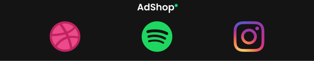
Dribble, Spotify, and Instagram do this effectively with their minimalist and sophisticated design.
Colors play an essential role in creating a visually striking app icon. Research shows that 92.6% of users look at the visual factors of a product before purchasing, and 84.7% prioritize the choice of colors when purchasing such a product.
Understanding how different colors affect how people see your app can help you choose colors consistent with its goals and messaging. Different colors can provoke different emotions and feelings, and while it can be tempting to use lots of colors in your app icon design, it’s often best to keep it simple.
If you use too many colors, your icon may appear congested and be difficult to read.
Limit your color palette to a few complementary hues distinct from one another.
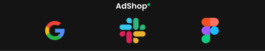
Google, Slack, and Figma effectively selected color combinations for their app icon design and blended them to create appealing results.
In app stores, there are millions of apps, many of which share similar features. A unique and memorable app icon can help your app differentiate itself from the competition and catch the eye of potential users.
A memorable app icon design can help build brand recognition and make it easier for users to identify your app.
Your app icon should be distinctive but still share certain characteristics with other apps in similar categories. This is important because it helps users associate your app with certain functionalities.
Think of brands like Target, Spotify, and Yelp and their app icons, which contain just a couple of vibrant colors and simple shapes.

App icon designs should have a focal point because it helps draw the user’s attention to the most important element of the icon.
The area of the symbol that stands out the most and conveys the meaning of the app is known as the focus point. Once the focal point has been established, you can design the remainder of the icon around it to produce a distinct, eye-catching, memorable app icon.
The Instagram app icon has a clear focal point in the form of the camera lens. This communicates the app’s purpose as a social media platform for sharing photos and videos. The Spotify app icon focal point is in the form of the sound waves emanating from the circle, and this communicates the app’s purpose as a music streaming service.
Finally, the Zoom app icon focal point, the video camera icon, clearly communicates the app’s purpose as a video conferencing and communication platform.
Including text in your app icon can make it difficult for users to read and understand the app’s purpose. Once an app’s icon is scaled down or viewed on a smaller device, the text automatically becomes smaller – making it harder to see.
Additionally, if you plan to release your app in multiple languages, including text in your icon design can make localizing harder. Creating a consistent and visually appealing design across different languages and regions becomes a task.
Rather, using a single distinct letter logo mark in your app icon design makes it easier for users to recognize your app. Netflix, Facebook, Upwork Talent, Skype, and Fiverr utilize their name’s first and second letters as their app’s icon design.

You can never get the best app icon design that drives conversion and installs at the first trial. Not even the best designers can!
That is why creating multiple versions of an app icon design is important, as carrying out A/B tests helps evaluate the user’s thinking and choices. Getting users’ feedback early in the design process is key to nailing your app icon design, saving cost, time, and labor.
Look at the different versions of an app icon design created by AdShop for the game Idle Space Industry. The design version that had the most interactions from users and increased conversions and installs was eventually chosen as the app icon design for the game.

Once you have created and uploaded your app’s icon design, you might think, “Finally, All Done!”. But you are not.
Your app icon design might suit the current period, but it will be for a while. Users’ wants and needs evolve, and you must keep up with them to stay relevant. Through evolution with customers’ trends and rebranding of their app icon designs, prominent brands have stayed at the top of their field and remain in power in the app store.
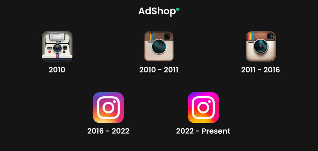
Instagram does this flawlessly with the evolution of its app icon design over the years, with its most recent iteration being the epitome of “simple but memorable.”
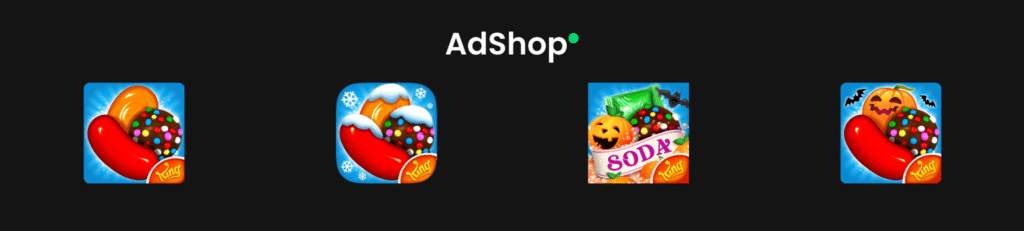
Another way is to incorporate app seasonality by switching your app icon design to fit the current season of the year (Christmas, Easter, Halloween).
Many apps do this, and it is a proven way to keep the users entertained with your app. Candy Crush switches its app icon designs to match the current season of the year.
The design of an app icon is something that should be noticed. App icons are critical to modern-day device screens, and a well-designed icon can help distinguish an app in a crowded app store, create a positive first impression, and convey a distinct brand identity.
At Adshop, we are excited to assist you in creating a unique app icon design for your application that not only helps your application stand out but also enhance users’ experience, and increase the number of downloads, thereby achieving your marketing goals.
Contact us today to get started on achieving your design goals.
Learn how to plan, execute and analyze a successful marketing campaign.

Understand the key differences between advertising and marketing.